Cegal brand guidelines
Cegal has a distinct brand that we are very proud of and are happy to share with the world!
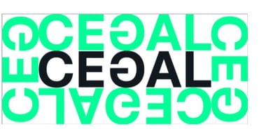
Our logo embodies the Cegal way. Simply put; We turn complex IT into digital success stories. Always use the approved artwork files.
Do
✅ Use only approved logo files
✅ Maintain correct proportions and alignment.
✅ Ensure adequate clear space around the logo
✅ Use the appropriate color version for light or dark backgrounds
✅ The logo should only be placed on backgrounds that provide adequate contrast and preserve legibility.
✅ Ensure the logo remains clear and legible at all sizes
Don't
❌ Stretch, compress, or distort the logo
❌ Modify colors or typography
❌ Add shadows, outlines, or other visual effects
❌ Rotate or reposition elements within the logo
❌ Place the logo on busy or low-contrast backgrounds
❌ Recreate or redraw the logo


To maintain clarity and brand consistency across all applications, please adhere to the following minimum sizing standards:


Whenever you use the Cegal logo, it must always be surrounded by clear space to ensure its visibility, recognizability, and impact. No graphic elements of any kind may enter this zone — including text, icons, shapes, borders, or other logos.
Cegal uses a fixed definition of safe space:
This ensures the logo always has enough room to breathe and is never visually crowded — regardless of format, placement, or partner branding.
Our colors are a clear identity marker across all touchpoints — profiling articles, publications, presentations, and all digital and physical channels. They must always be used consistently and deliberately.By using our primary and secondary colors consistently and with discipline, we ensure a strong, recognizable, and cohesive Cegal identity.
By using our primary and secondary colors consistently and with discipline, we ensure a strong, recognizable, and cohesive Cegal identity.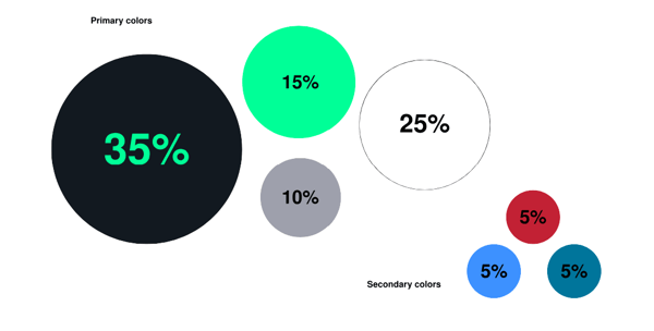
Do
-1.svg)
Don't
.svg)